Contemporary art across various media in Asia borrows a lot of Western influence, especially in the entertainment industry. Movie buffs will agree that some of the best Asian films of the last decade were so good that we forgot where they came from. But often overlooked is the first point of contact a movie gets with its audience — the promotional poster.
Here’s a round-up of our favourite movie poster designs from the past couple of years and why they were so effective in engaging audiences.
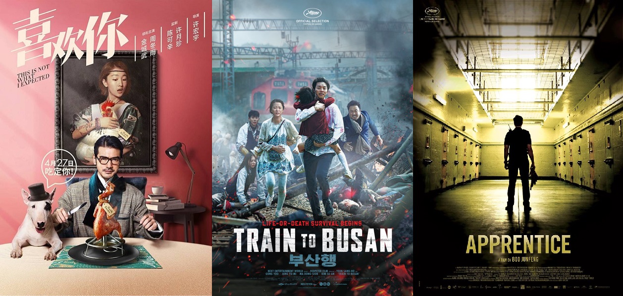
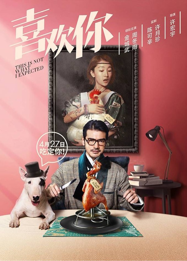
This Is Not What I Expected (2017)
China
This Is Not What I Expected/Golden Village PIctures
This Is Not What I Expected/Golden Village Pictures
The Rundown: Handsome, wealthy hotel executive Lu Jin is a perfectionist and gourmand who thought that he had seen it all. When he checks into the Rosebud, where he is utterly dissatisfied with every aspect of the hotel, he is surprised by the perfect meal prepared by flamboyant female sous chef Gu Shengnan. Complete opposites, sparks fly as the two rivals find themselves brought together in the kitchen for a romantic comedy that is both light-hearted and delicious.
What we like: Bright, quirky, and slightly saccharine, all the poster designs perfectly reflect the movie itself, which is more food porn than romantic comedy. The use of a pastel palette keeps the whimsy alive, while humorous juxtapositions of the two lead characters also enhance their dynamic in the movie of “opposites attract”.
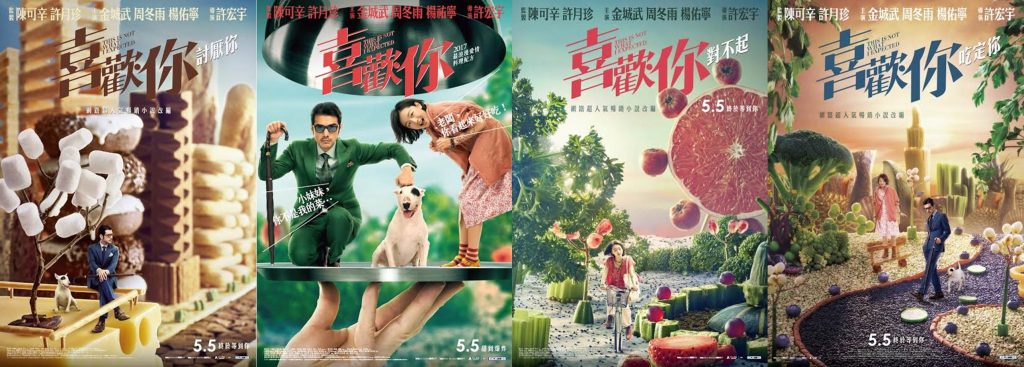
Busanhaeng / Train to Busan (2016)
South Korea
Train To Busan/Golden Village Pictures
The Rundown: A divorced, workaholic fund-manager takes his estranged daughter on a train to Busan to see her mother. They soon get trapped with other passengers as a countrywide zombie outbreak hits the train, sending it speeding down the tracks. Two things are certain — first, Asian zombies are freaky as hell and second, you can trust a Korean zombie movie to make you want to cry at the end.
What we like: The overall chaos shown in the poster is exactly what happens from the moment the zombies attack until the end of the movie. At first glance, you wouldn’t really notice the zombies on the left in the background, and you might think the movie is just about a train crash. Sneaky, sneaky. The use of colour, smoke and a pregnant character further accentuate the chaos and intensity.
Apprentice (2016)
Singapore
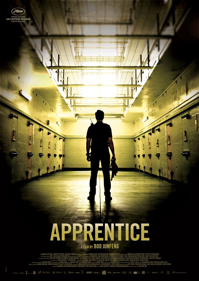
Apprentice/Clover Films and Golden Village Pictures
The Rundown: A 28-year old correctional officer gets transferred to the top prison in his territory where he becomes the apprentice to the executioner — the very same man who executed his father years earlier. The protagonist is haunted both by his past, and by the normalcy with which the executioner does his job.
What we like: Tasteful framing and vignetting suggest a peek into the life of an executioner’s apprentice, without giving away the premise of the story. The use of yellows and blacks brings out the grim atmosphere of a prison that still executes offenders by hanging.
Have you seen any exceptional movie posters that are made in Asia? Share them with us in the comments below!


